Annotation View
Serving as the heart of QuickGraph, the Annotation View is where all the annotation action happens. The design of the Annotation View is rooted in a minimalistic approach to ensure seamless user interaction and focus on the task at hand: annotation.
In this section, we will delve into the features present in this view, illustrating how it aligns with QuickGraph's core design philosophy of reducing UI clutter through enhanced UX design.
The Annotation View's layout is organised into four main components:
- Primary Sidebar: This is...
- Toolbar: This contains...
- Main View: This is where...
- Secondary Sidebar: This includes...
Each of these components plays a distinct role in making the annotation process in QuickGraph straightforward and efficient. In the following sections, we'll explore each of these in more detail.
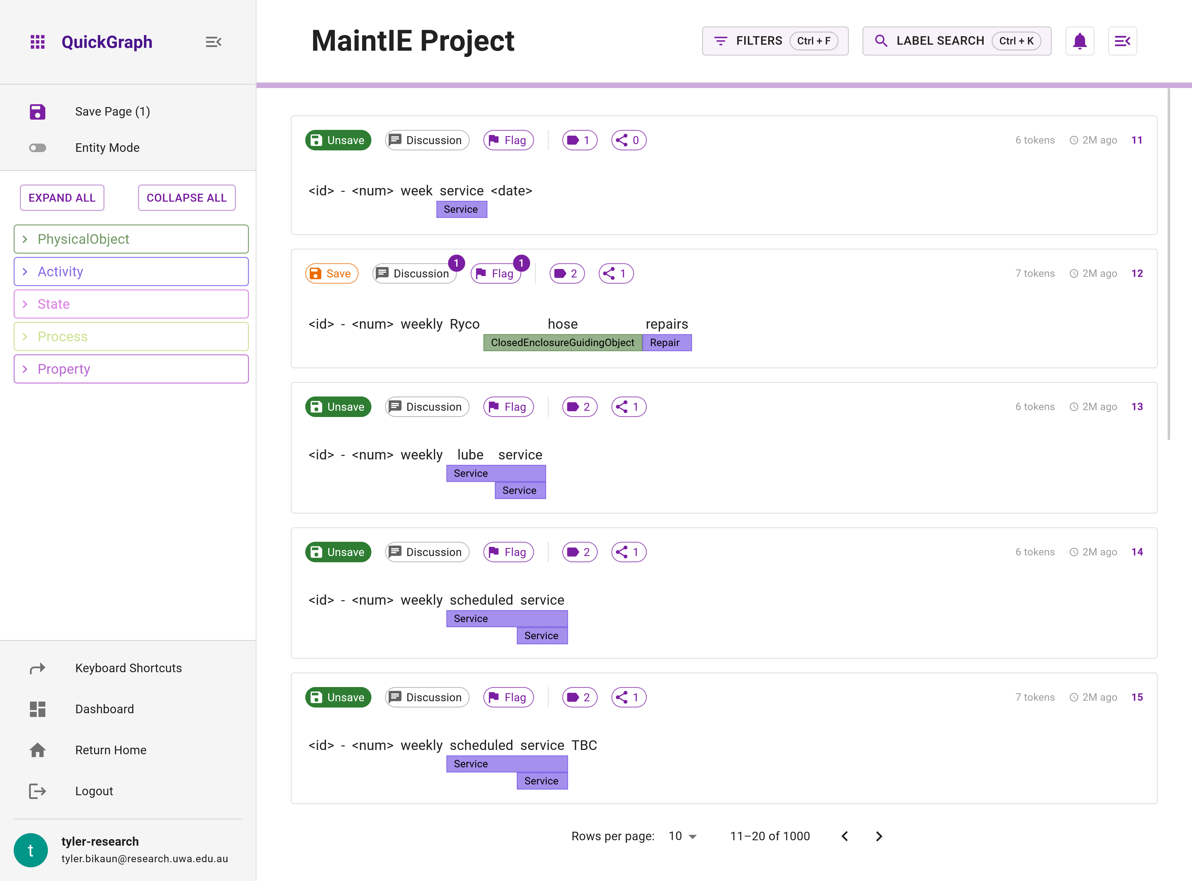
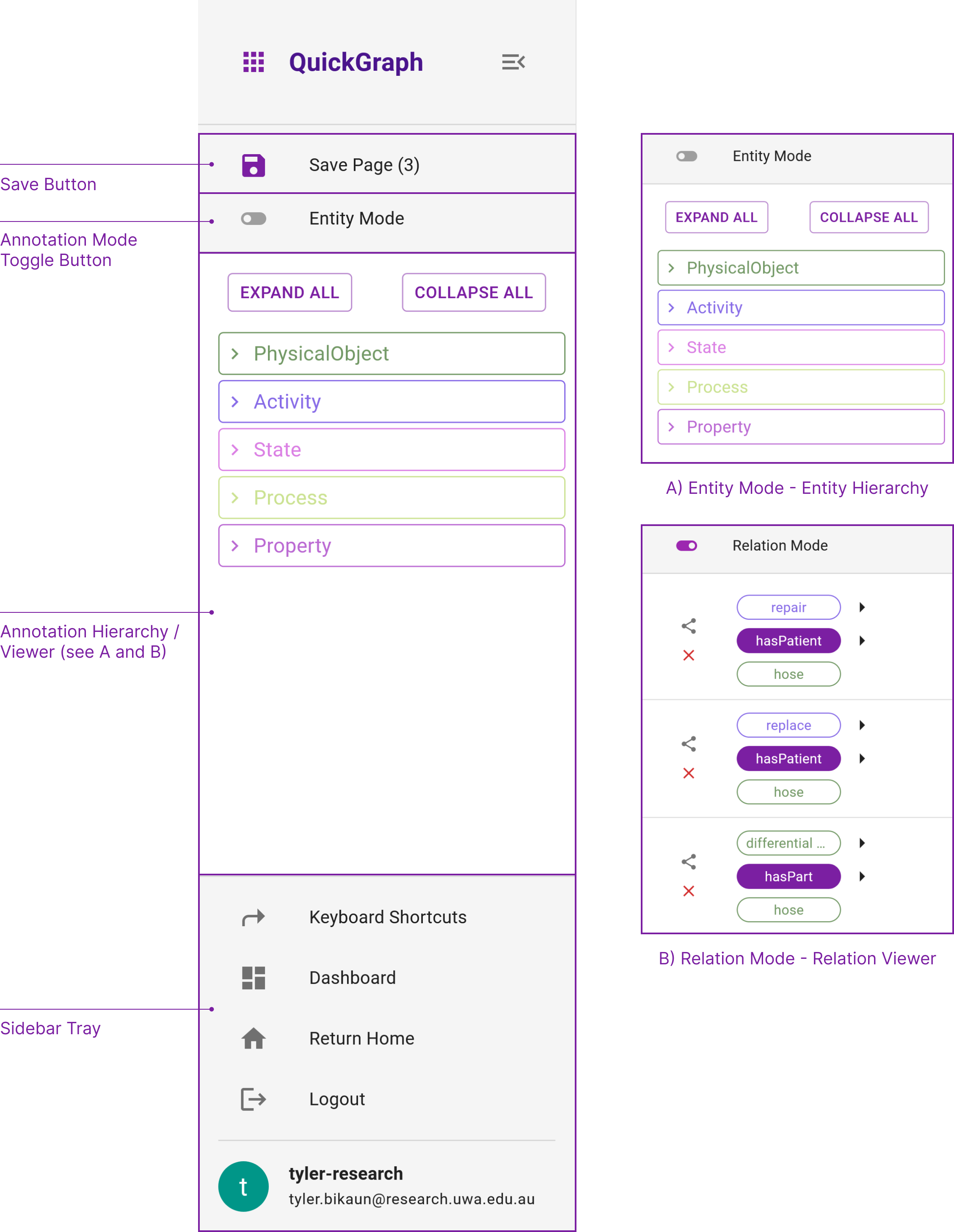
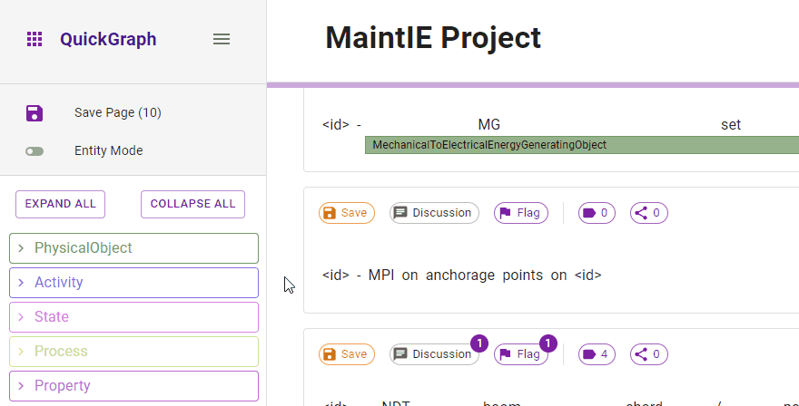
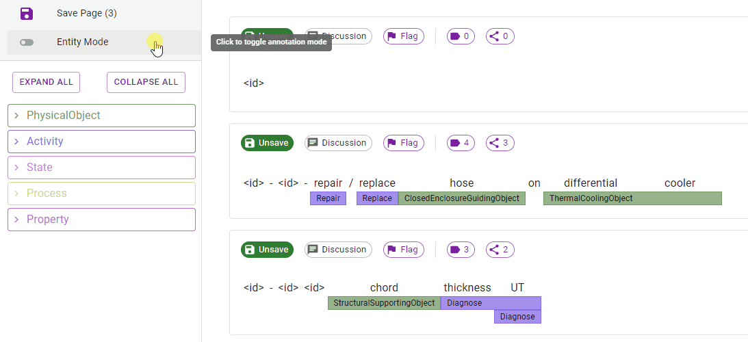
1. Primary Sidebar
The Primary Sidebar contains everything you need to streamline your annotation (Figure 2). The primary features of this component are the Save Button, Annotation Mode Toggle Button, Entity Hierarchy, Relation Viewer, and Sidebar Tray.
Save Button
The save button is used to save all unsaved dataset items on the current page. The button indicates whether unsaved items exist via its color change and the number in the label. This button must be double clicked.
Saved dataset items in QuickGraph do not allow additional annotations to be made until it is in an unsaved state. This is due to agreement measures being calculated on save events.
All actions made on dataset items such as flags, annotations, discussions, etc., are automatically saved. However, saving dataset items indicates that you are satisfied with the state of that item. Moreover, items can be saved/unsaved individually by using the Save button on the individual items action tray. Saved items also are excluded from propagation events.
Annotation Mode Toggle
This is only visible if your project is entity and relation annotation.
Toggle between entity and relation annotation mode. This will change the mode of annotation and the display of elements on the interface.
Relation mode disables Suggested (Weak) entities from being selected. This is intentional and requires you to accept these entities prior to relations can be applied.
Annotation Mode Hiearchy / Viewer
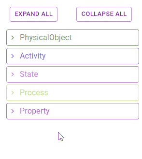
Entity Hierarchy
The Entity Hiearchy represents the entity ontology assigned to this project. To apply entities via the hierarchy - ensure that a token span is selected and then simply click on the desired label in the hiearchy (Figure 3).
Nested labels can be expanded by clicking the chevron. For large entity hierarchies, the Expand All and Collapse All buttons can assist in finding items (Figure 4).
Relation viewer
The Relation Viewer showcases the relations applied to a selected item in your dataset. This useful tool makes it easy to visualise and manage relations, whether that means removing existing relations or accepting suggested ones.
If an item doesn't have any relations, the viewer will display the message "no relations exist for this item." Note that suggested entities won't appear in relation mode as relations can only be manually applied between accepted entities.
Whilst in relation mode, you must select an item by clicking to trigger the relations on it to be visible.
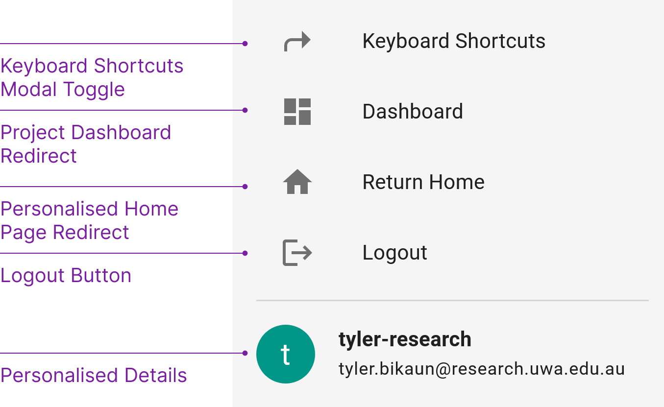
Sidebar Tray
The Sidebar Tray (Figure n) contains quick links to the keyboard shortcuts, project dashboard, personalised home page, and logout.
2. Toolbar
The Toolbar (Figure 6) contains the Project Name, Progress Bar and buttons to toggle the Filters, Label Search, Notifications, and Secondary Sidebar.
Project Name
This is the name of the project currently being annotated.
Progress Bar
The Progress Bar displays the current progress (saved dataset items) made on the project as a percentage. Hovering the bar will show the count (saved dataset items / total dataset items).
Filters (Ctrl + F)
The Filters (Figure 7) allow you to refine the project dataset for items with the following attributes or content:
- Text Search: comma separated search term(s) e.g.
replace,oilorbarack,obama,lives in. This is a strictANDoperation between search terms. Matches whole tokens and is case insensitive. - Saved:
Unsaved,Saved, orEverything. DefaultEverything. - Flag(s):
No Flags,Issue,Quality,Uncertain, orEverything. DefaultEverything - Quality:
Suggested,Accepted, orEverything. DefaultEverything. - Relation(s):
No Relations,Has Relations, orEverything. DefaultEverything. - Dataset Item Id(s): comma separated dataset item id(s)
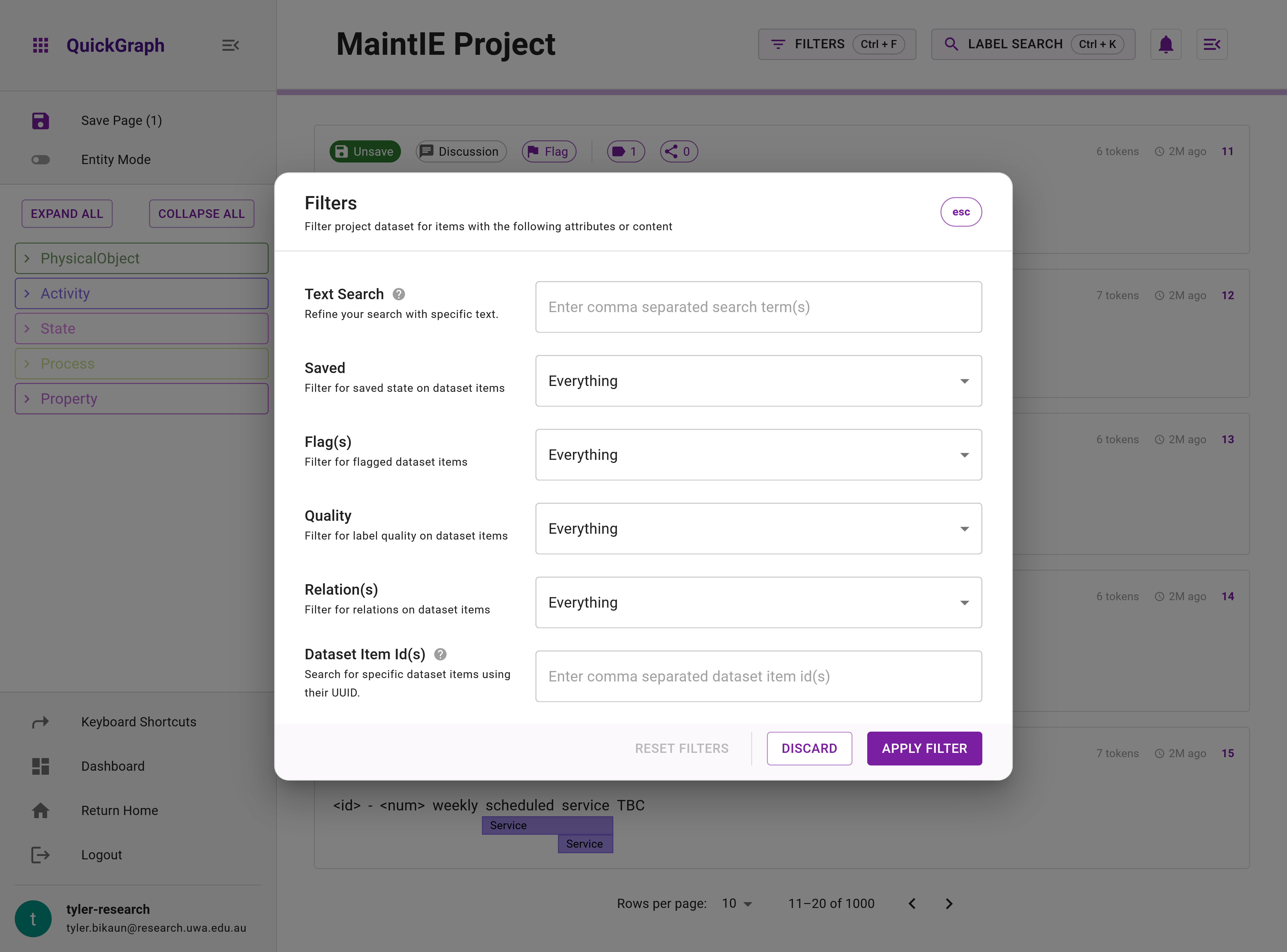
Relations filter is only visible on entity and relation annotation projects.
Label Search (Ctrl + K)
The Label Search function is a powerful tool designed to expedite the process of locating entity labels in large hierarchies (Figure 8). Rather than manually traversing the entity hierarchy, you can use Label Search to conduct a text-based search for entity labels. This tool also maintains a history of entities applied in the annotation session as well as offers suggested labels if a token span is selected. The recently applied entities feature enables you to apply labels without locating them in the hierarchy, reducing annotation time.
Remember to select a token span in order to view recently applied entities and suggestions. You can activate the Label Search feature quickly by using the Ctrl + K shortcut.
Notification Bell
The Notification Bell serves as your personal assistant while annotating, diligently accumulating any notifications you've received. It acts as a central hub for alerts, updates, and important communications, keeping you informed and up-to-date with ongoing activities and events.
Secondary Sidebar Toggle
The Secondary Sidebar Toggle is used to open the Secondary Sidebar.
3. Main View
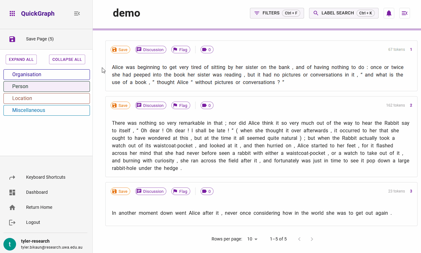
The Main View of the annotation view contains the most important elements of QuickGraph - dataset items ready for annotation. It displays an array of dataset items concurrently, the quantity of which is defined by the specified page size, found in the pagination controls situated at the page's lower section. The visible dataset items also depend on any active filters applied. Each dataset item is situated in a Dataset Item Container outlined below. Interacting with tokens in the Dataset Item Container allows you to take advantage of QuickGraph's rich annotation features and propagation.
Dataset Item Container
The Dataset Item Container represents a single item in the dataset. This container comprises three essential consituents which are described in detail below.
The container consists of text for annotation including annotation markup, an action tray, and contextual information such as applied entities and relations, the items size (tokens), time since last updated, and its index.
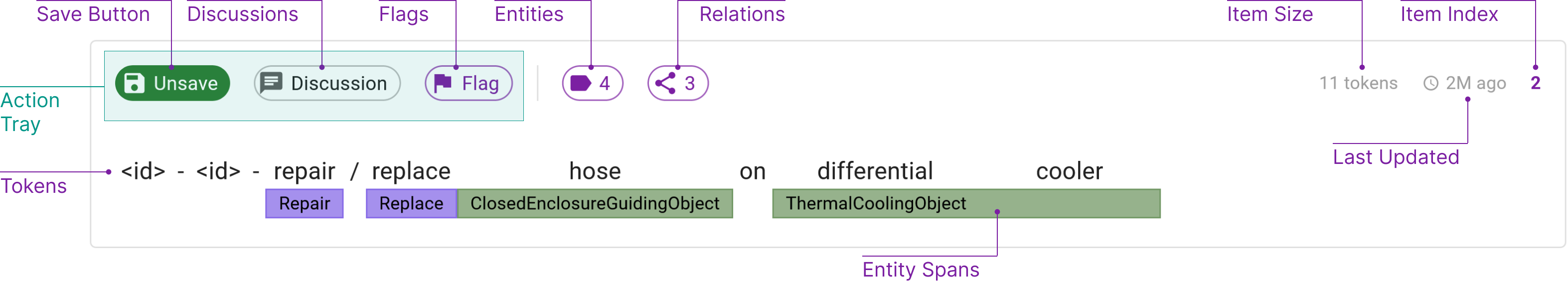
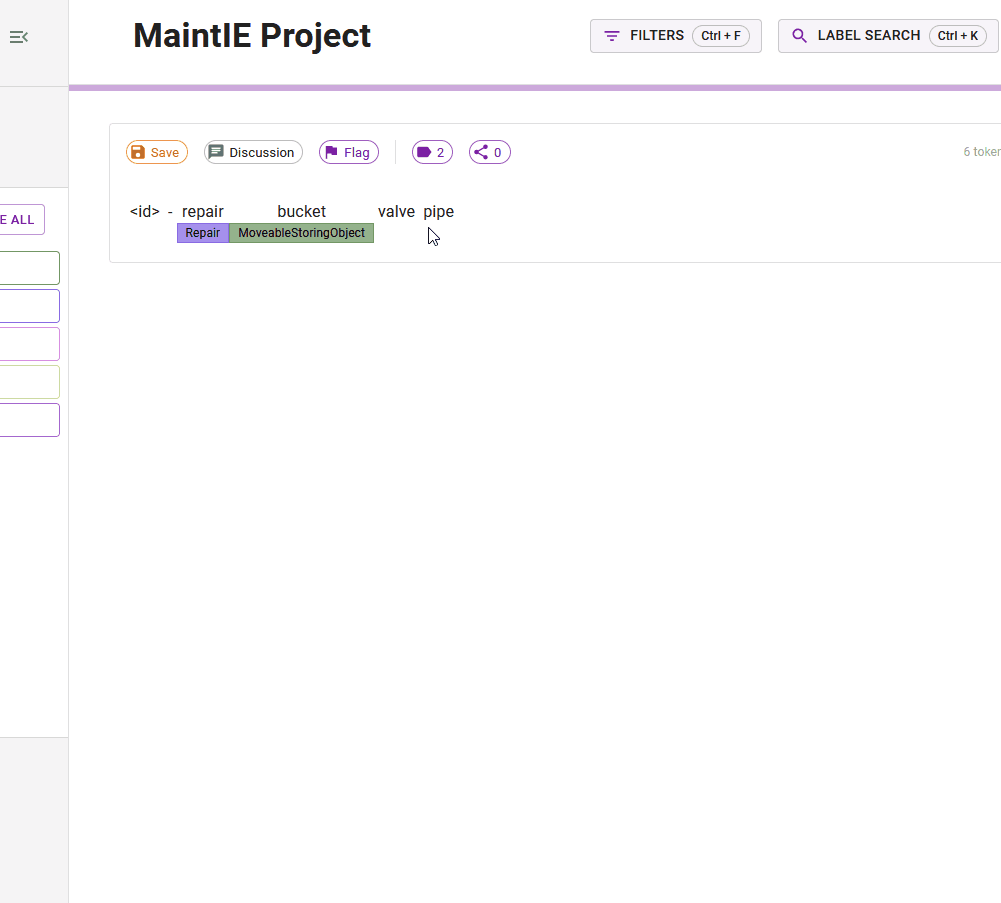
Annotation Text and Markup
This primary component consists of the text that requires annotation, accompanied by annotation markup. This markup aids in the process of annotation by highlighting and distinguishing different sections of the text.
Action Tray
The Action Tray is an interactive part of the Dataset Item Container. It houses actions including Save Toggle, Discussion Toggle and Flag Toggle.
Save Toggle:
Clicking the Save chip on the action tray will toggle the save state for the given dataset item. If the dataset item is saved you will not be able to modify the annotations made and will have to unsave the document to modify them. Each time you save the document, its associated inter-annotator agreement is updated.
Discussion Toggle: Clicking the Discussion chip will reveal the dataset item discussion in the Secondary Sidebar. The badge on the chip indicates how many comments have been made on this dataset item.
Flag Toggle: Clicking the Flag chip reveals a multi-select field of flags that can be applied to the dataset item. The flags can be simpled toggled on and off by clicking. The badge on the chip indicates how many flags you have applied.
Contextual Details
The final component of the Dataset Item Container provides valuable contextual information about the dataset item. This includes data such as applied entities and relations, the item's size measured in tokens, the time elapsed since the last update, and the item's specific index within the dataset. These details can assist users in understanding the item's relevance, complexity, and the overall progress of their work.
The badge on the entities and relations chips will reveal the number of suggestions pending review. Hovering over the index of the dataset item will reveal additional information such as its external id.
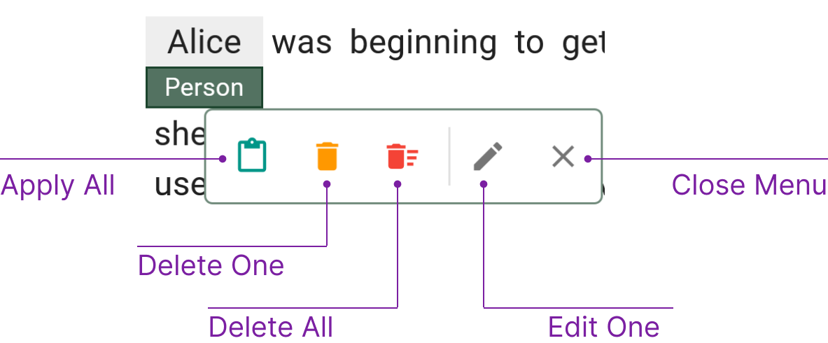
Annotation Propagation
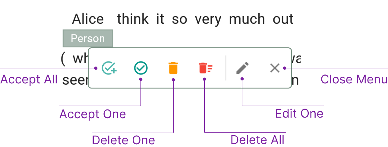
Annotation propagation is a core feature of QuickGraph to speed up the annotation process. Figure n demonstrates the entity context menu which supports the atomic operations:
- Apply all: Apply the entity across the corpus - this matches token spans that do not already have the applied markup type. Entities that match will have
suggested(weak) markup which must be accepted by the annotator. - Accept all: Accept all suggested entities. This is only visible on suggested entities. It will accept all similar entities with the same token span and entity type.
- Accept one: Accept one suggested entity. This is only visible on suggested entities. It will accept this individual entity.
- Delete one: Delete one accepted or suggested entity. This is visible on all entities. It will delete this individual entity.
- Delete all: Delete all accepted or suggested entities. This is visible on all entities. It will delete all entities with the same token span and entity type. However, for suggested entities, only suggested ones will be deleted, accepted entities will not.
- Edit one: Edit the markup type of a single entity. This will change the type of the individual entity.
Relations are propagated but are constrained based on direction (left-right, right-left, source/target) and offset. In the future this will be made more robust.
Entity Context Menu
Relation Context Menu
Similar to the Entity Context Menu, the Relation Context Menu has the atomic actions:
- Apply all (currently unavailable:)
- Apply one:
- Accept all:
- Accept one:
- Delete one:
- Delete all:
After selecting an action, the relation popover will be closed requiring you to reselect the source and target entities to add additional relations.
Relation constraints and apply all functionality are currently unavailable.
4. Secondary Sidebar
The secondary sidebar comprises four distinct views designed to enhance your annotation experience:
- Insights
- Social
- History
- Guidelines
Insights
The Insights view presents a consolidated view of entities along with their corresponding classes and surface forms. This feature helps pinpoint inconsistencies in entity annotation and offers valuable insights into complex instances. By analyzing comparable surface forms, users can accurately determine the most suitable label to apply. To further refine the displayed entities, filters can be applied based on class or surface form.
Relation insights are part of our Planned Features roadmap.
Social
The Social view facilitates discussions on dataset items. Access this view by clicking the Discussions button on the dataset item action tray. Here, you can comment on observations related to the dataset item. In projects where discussions are allowed, other annotators can view these comments, promoting enhanced annotation quality. If discussions are disabled, you will only see your own comments. Delete any comment by clicking the trash icon.
History
The History view presents an overview of your current annotation session, detailing all actions performed on the dataset, including annotations, saves, flags, and more. This feature helps you keep track of your work.
Guidelines
The Guidelines view offers quick access to the project's guidelines, supporting consistent annotation and providing clarification or context for the dataset. By referring to these guidelines, users can better understand the correct application of entities and relations.
Miscellaneous
Snackbars
Sidebar Minification
Useful for large ontologies to give you more space to navigate. This collapses the bottom navigation items.