Reviewing your progress
Now that we've annotated our first dataset item, we can take a look at the project's dashboard. The project dashboard provides detailed insight into annotation progress, agreement, knowledge graph, and so forth. It also contains comprehensive controls for project management including adjudication, dataset modification, and task/ontology configuration. There are two ways to navigate to a project's dashboard:
- From the Projects Explorer by clicking the Dashboard button, or
- From the Annotation View by clicking the Dashboard button in the sidebar tray.
Overview
After navigating to the project's dashboard, you are presented an overview of the project (Figure 1). The overview includes high-level metrics and visualisations. See the Project Dashboard page for more information.
Step 1: Navigate to the Alice In Wonderland project dashboard
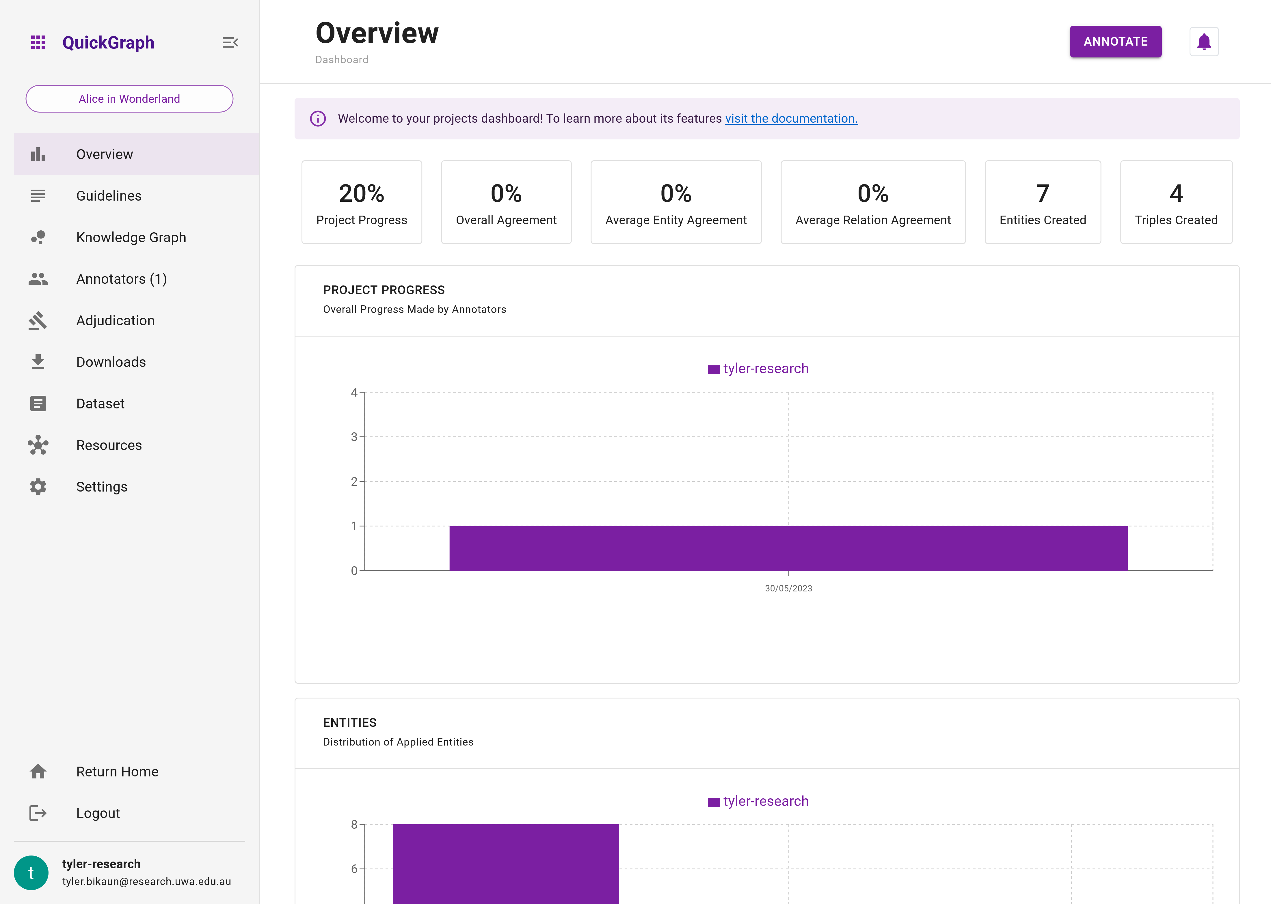
We can see that so far, we've completed 20% of the dataset, and created 7 entities and 4 triples (relations). The agreement is set to 0% for all agreement types as we have no collaborators at the moment. Scrolling down, we can see the number of dataset items we've saved (1), and the distribution of entities and relations we've applied. Additional plots will appear based on further interaction with dataset items such as adding flags or posting comments.
Step 2: Scroll down and review the visualisations on the Dashboard Overview.
Knowledge Graph
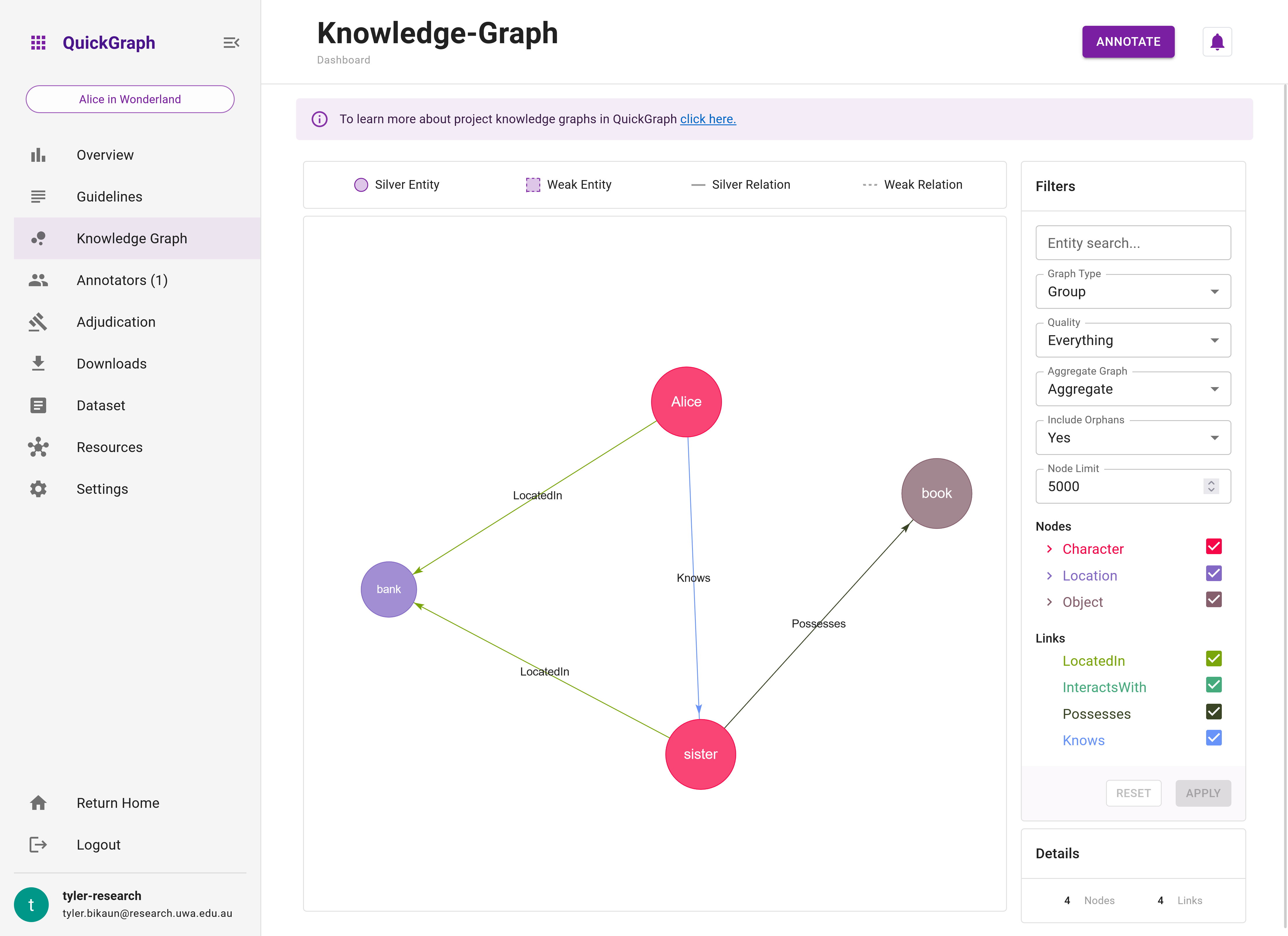
A key feature of QuickGraph is its real-time knowledge graph which is built from project annotations. Let's have a look at the graph we've currently created.
Step 3: Click on the Knowledge Graph tab in the left hand sidebar to reveal the project Knowledge Graph.
Although we've only applied a few entities and relations, this is still enough to interact with the knowledge graph visualisation function. We're only going to look at the basics of the graph, but there are lots of ways to explore your own and your groups annotations.
Figure 2 shows the graph that been created for us so far. By default, the graph shown is an 'aggregated' 'group graph'. In other words, it is created from dataset items that have been saved by a minimum number of annotators (see Project Settings) where the annotations are aggregated based (entities are aggregated based on their label and surface form, whereas relations are aggregated based on their source entity, target entity and label).
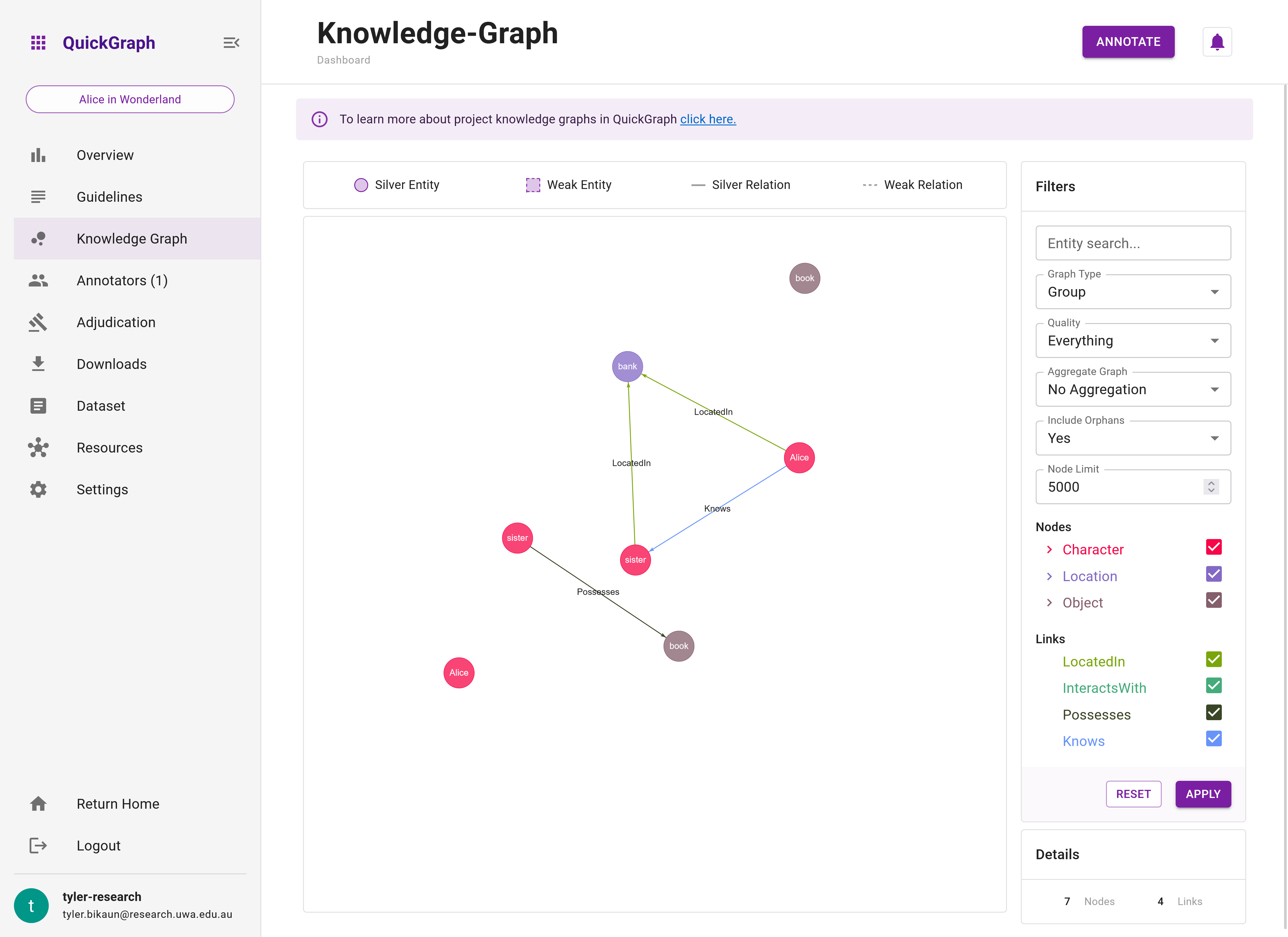
The aggregated group graph (Figure 2) summarises the knowledge extracted from annotations. In contrast, Figure 3 shows the 'standard' group graph which does not aggregate annotations. Instead, the 'standard' graph shows the subgraphs made on each data set item. Here, you'll see duplicate entities and relations.
Step 4: Change the graph type from Aggregated to No Aggregation by using the graph filters panel.
Wrap Up
Now that we've seen a high-level overview of our project and a glimpse of the knowledge graph functionality that QuickGraph provides, let's see how we can download the annotations we've created to support downstream tasks like machine learning applications.