Knowledge Graph
Knowledge graphs are only available for entity and relation annotation projects.
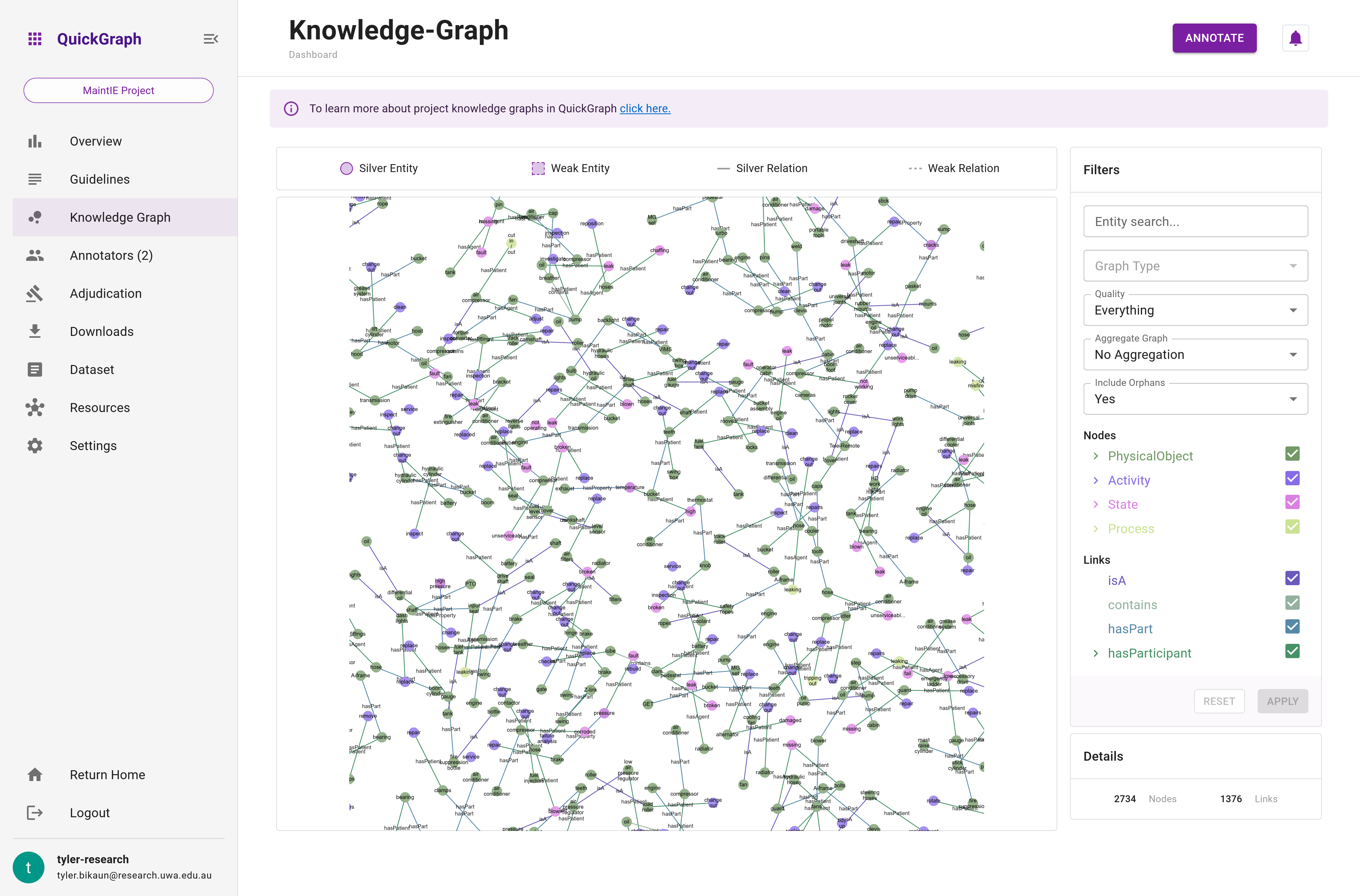
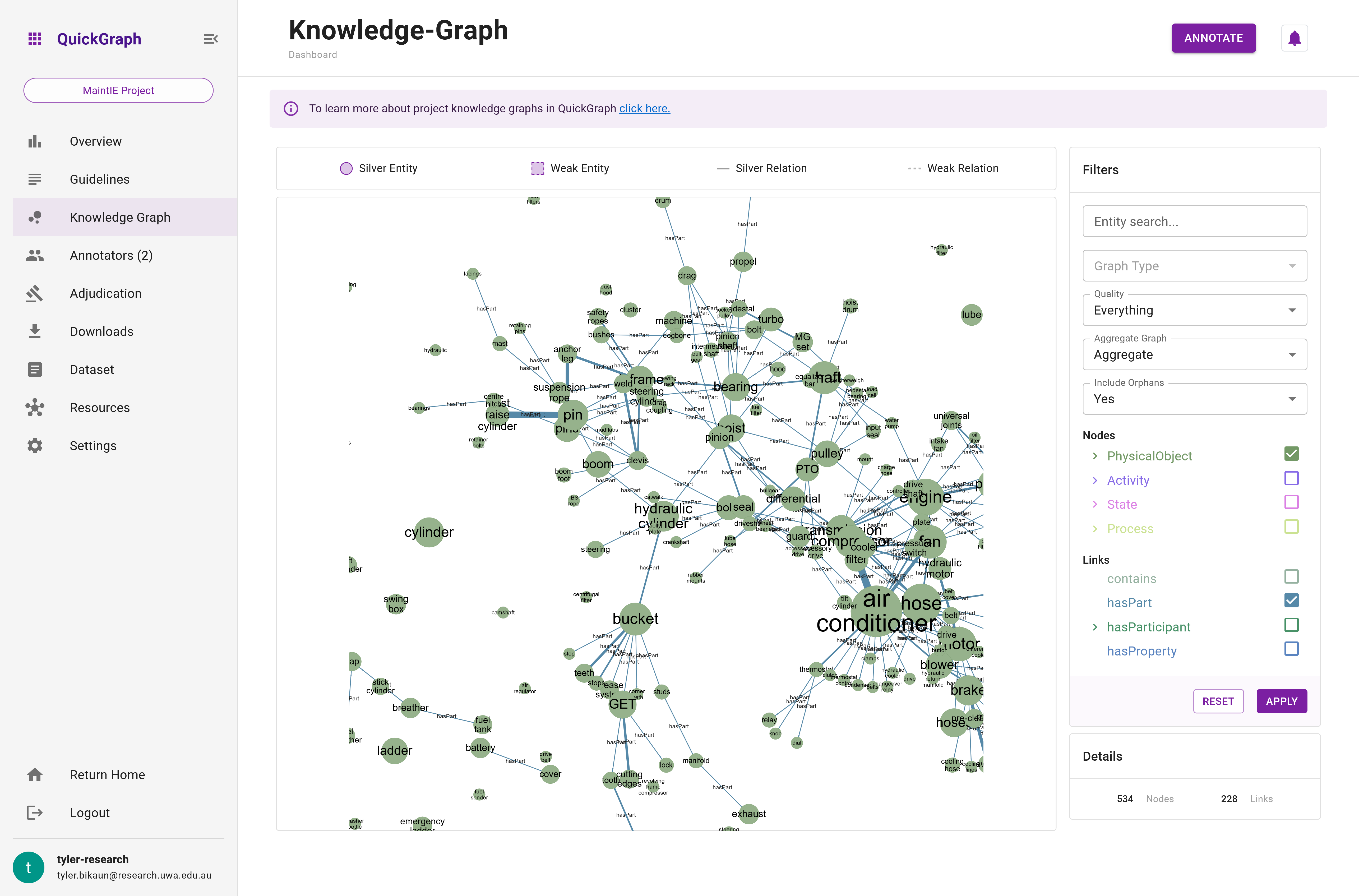
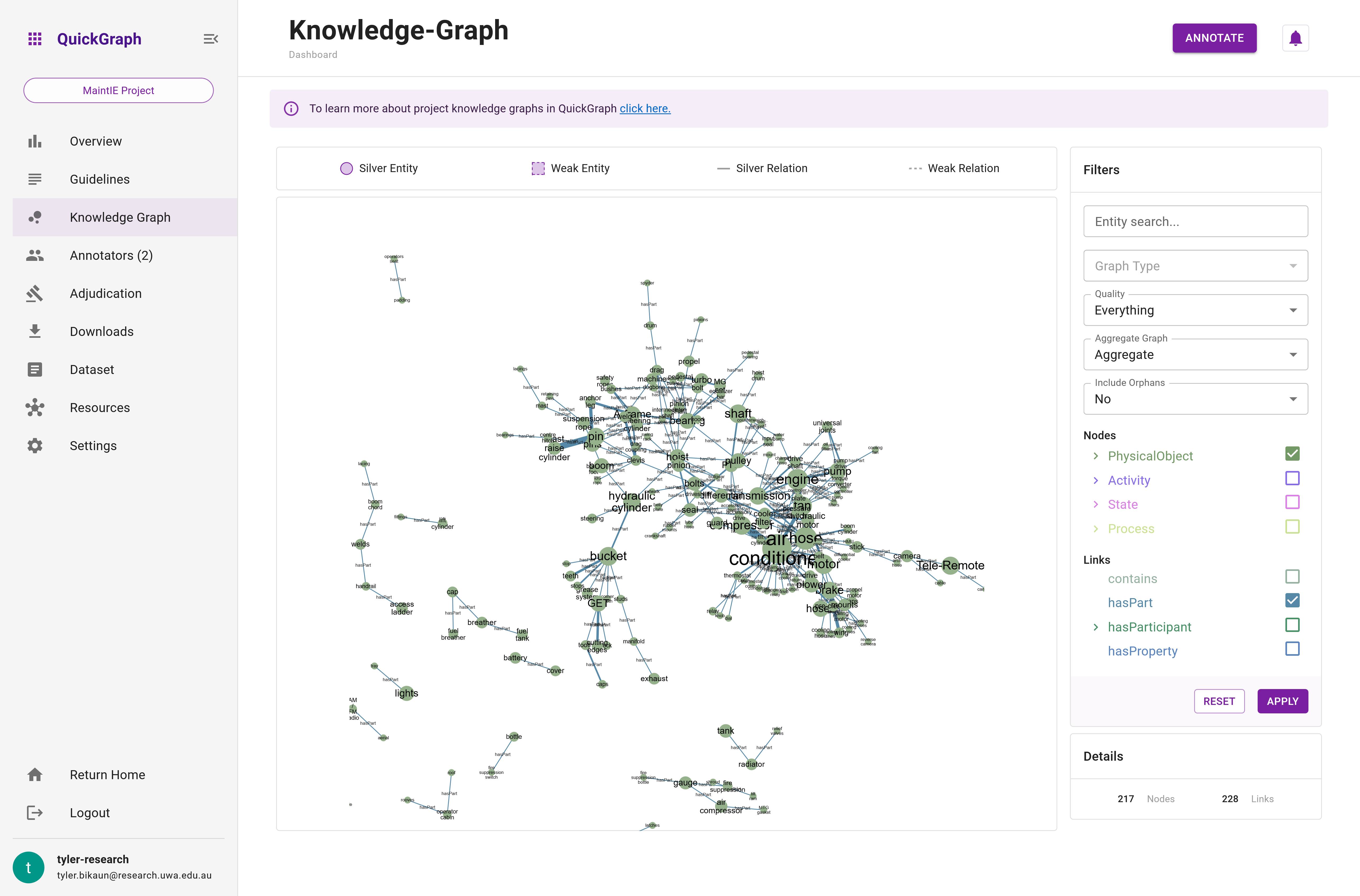
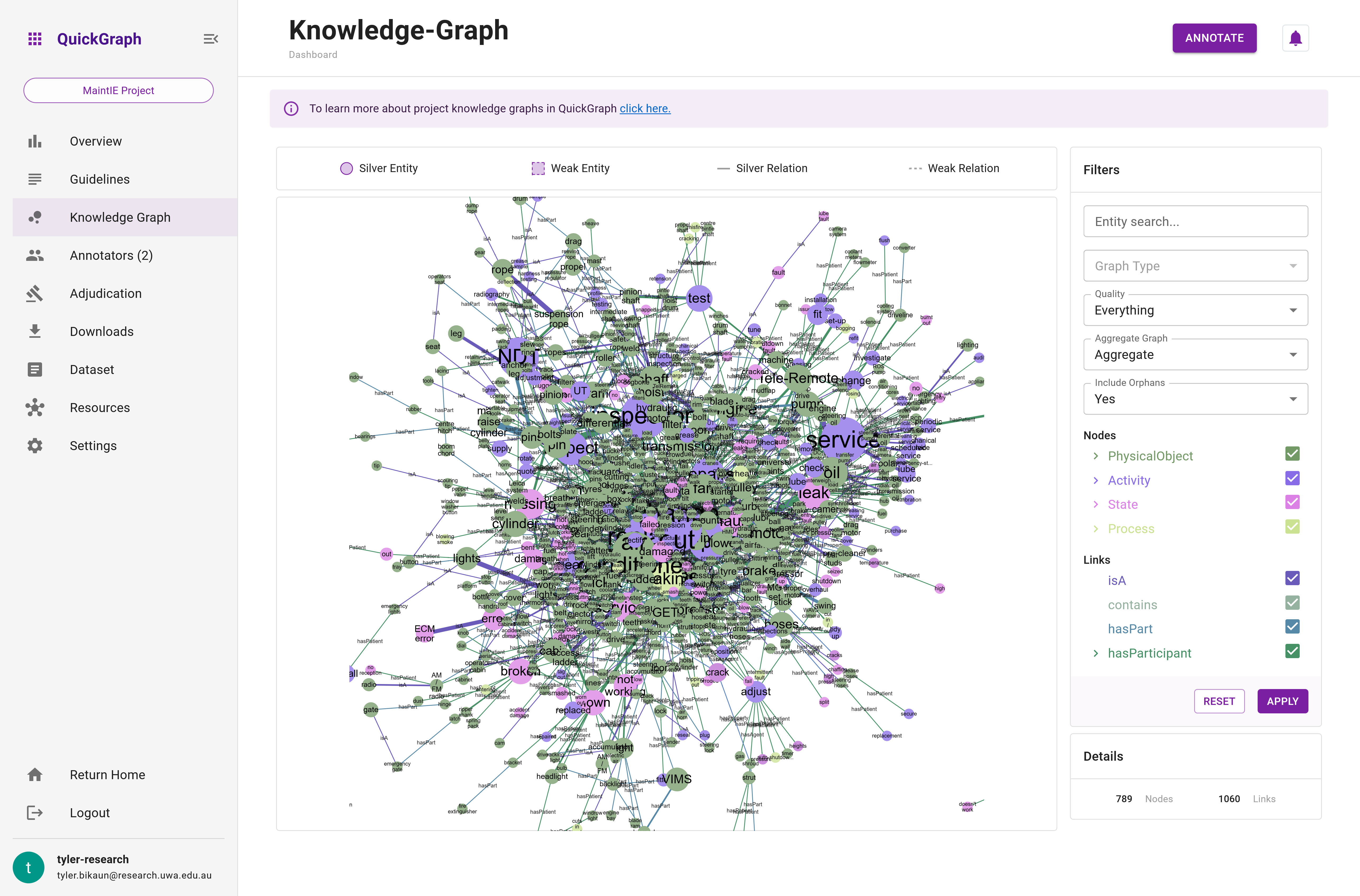
The Knowledge Graph is an interactive graph visualisation (Figure 1) that showcases the current state of a project's annotations, emphasising dataset items that meet the minimum save requirements and their annotations with majority agreement. This powerful and dynamic tool eliminates the need to use third-party software like Neo4J or Gephi prematurely, by offering users rich filtering and aggregation functionality to explore the relationships and structures within the project's data.
Loading large knowledge graphs may take a few minutes. Please be patient.
Interactive Graph Visualisation
The Knowledge Graph is designed to provide a clear and comprehensive visual representation of the project's annotations. It renders entities as nodes and relations as edges, effectively transforming the annotations into a navigable network (Figure 2). This interactive visualisation allows users to pan, zoom, and select nodes and edges for effortless exploration and analysis of the data.

The knowledge graph is made up of four components:
- Legend
- Graph
- Details
- Filters
1. Legend
The Legend is an integral component of the knowledge graph as it provides a guide to interpreting the graph visualisation. It exemplifies the various types of symbols and their meanings utilized in the knowledge graph, including:
Entities and Relations: These are the fundamental building blocks of the knowledge graph, representing the nodes (entities) and the links (relations) between them.
Quality Indicators: These symbols distinguish between 'weak' (suggested) and 'silver' (accepted) qualities of the information represented in the graph.
Below, you'll find an image (Figure 3) of the Legend to help you better understand its components. Please refer to this whenever you're viewing the knowledge graph.

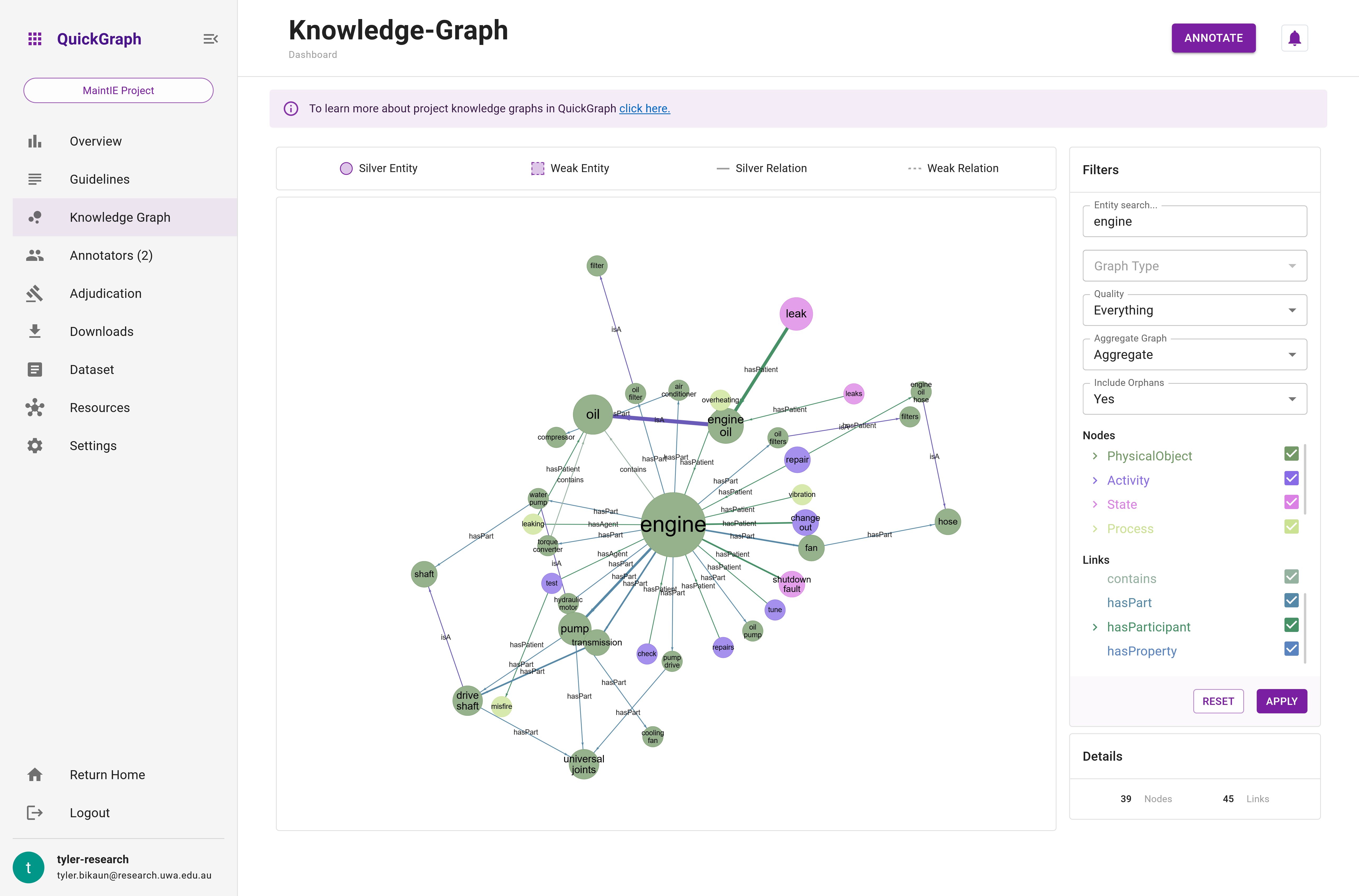
2. Graph
The Graph component is the main component of the dashboard Knowledge Graph. The graph is interactive, allowing zooming, hovering, and dragging. The color of the nodes and their pattern indicate their classification and quality. The color of the nodes and edges can be referenced against the entity and relation hierarchies in the Filters component. However, hovering over the nodes and edges will also show their details (see Figure n). Figure n above illustrates how to interact with the graph.
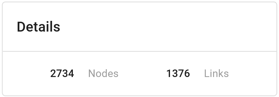
3. Details
The Details feature provides a statistical snapshot of the current state of the knowledge graph. As of now, this includes a count of nodes (representing entities) and links (representing relations) within the graph.
These statistics are dynamic in nature, updating in real-time as you apply different filtering or aggregation operations to the graph. Therefore, the Details component offers a quick way to gauge the complexity and scale of your graph at any given moment.
Refer to the image below (Figure 4) for a clearer understanding of how this feature appears on the interface.
4. Rich Filtering and Aggregation Functionality
The Knowledge Graph equips users with various features that enable them to filter and aggregate data based on their requirements. These functionalities include:
- Search Functionality: The search feature allows users to refine the graph for documents that meet specific search criteria.
- Group or Annotator Graph: Users can toggle between viewing the entire group's graph, constructed from majority agreed annotations, or examine their own graph or those of their collaborators (see below for more details).
- Annotation Quality: Users can filter the graph based on annotation quality - weak, silver, or both.
- Orphan Entities: The graph can be toggled to display or hide disconnected entities (nodes).
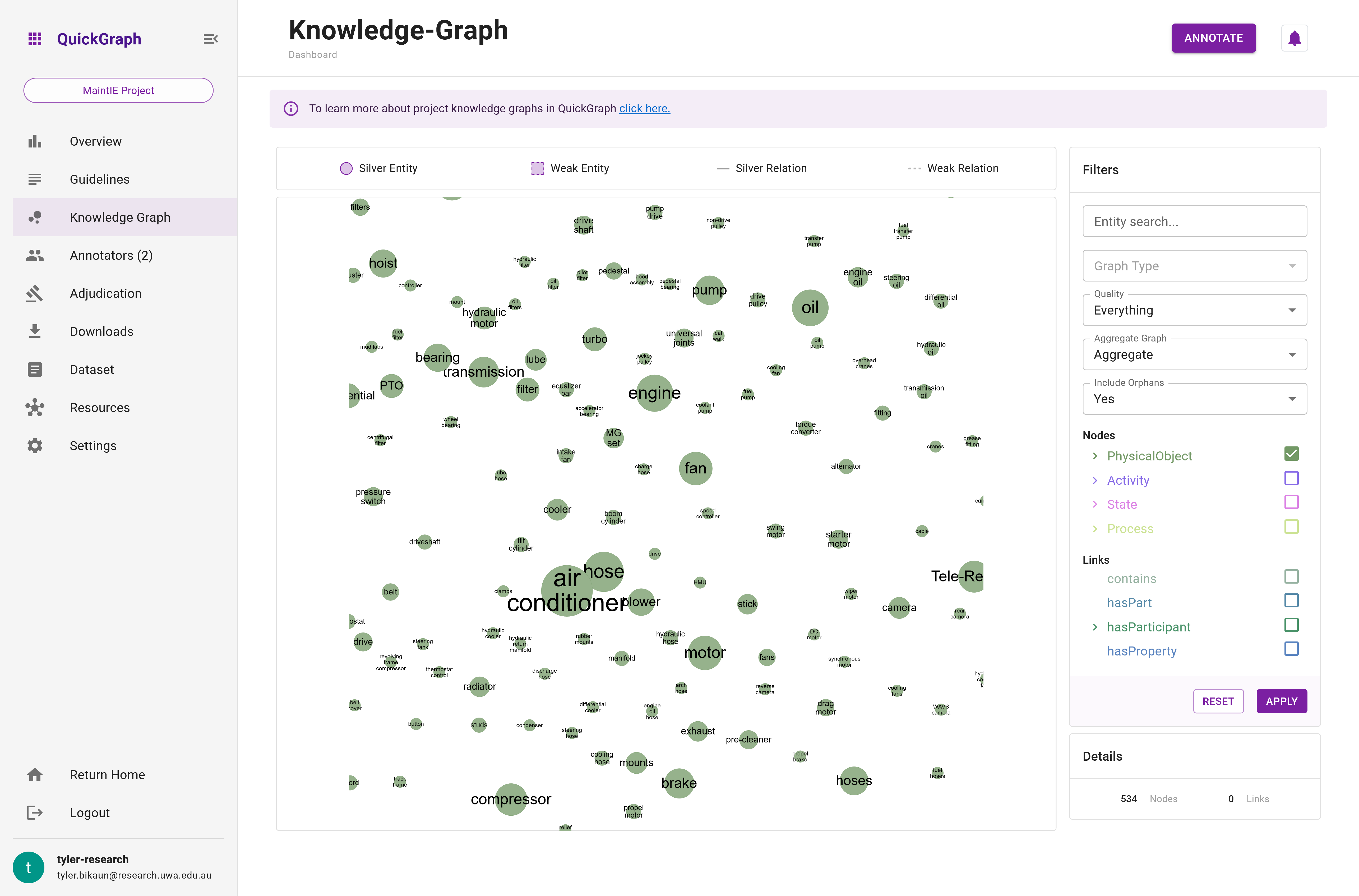
- Node and Edge Filtering: A user-friendly tree selector enables users to filter nodes and edges based on specific criteria, allowing for focused exploration of particular aspects of the data.
- Graph Aggregation: Users can choose to display the entire graph as annotations made on each dataset item or aggregate the graph to see an overview of the phenomena in their project, revealing how annotations are combined (see below for more details).
By leveraging the Knowledge Graph's interactive visualisation and robust filtering and aggregation functionalities, users can gain valuable insights into their project's data, identify patterns and trends, and make informed decisions about the project's direction and priorities. This powerful tool is an essential asset for managing and analysing complex annotation projects.
Entity Search
Entity and Relation Filtering
Quality Filter
...
Orphans
Group vs. Annotator Graph
A visual representation of this concept is coming soon.
QuickGraph offers support for two distinct types of graphs: group and annotator graphs. The group graph provides a comprehensive overview of all annotations agreed upon by the group at a given time. In this graph, each node and edge has majority consensus, and annotations are exclusively sourced from documents that meet the minimum annotation threshold.
For instance, consider a project involving three annotators, ten documents, and a minimum save threshold of three. If all three annotators applied identical annotations but only two of them saved the documents, the graph would not be generated. However, if the third annotator saved their documents as well, the graph would then be constructed using all the mutually agreed-upon annotations.
This approach serves two primary purposes. Firstly, it remains uncertain whether annotations will be saved until the documents are actually saved. Secondly, presenting only the annotations with consensus ensures that the resulting graph reflects a gold-standard corpus, which is likely to be employed for training machine learning and NLP systems.
On the other hand, the annotator graph is generated from annotations made by a single user, making it valuable for visualising personal or collaborative progress on a project.
Weak annotations may appear in either graph, depending on the nature of the annotations. If they meet the necessary requirements, the group graph will include them.
Graph Aggregation
Graph aggregation is a crucial visualisation feature in QuickGraph. Users can toggle aggregation on and off based on the desired level of detail.
Non-aggregated (Standard) Graph
The non-aggregated (standard) graph showcases annotations made on each individual dataset item. This type of graph is beneficial for:
- Understanding detailed relationships between specific data points.
- Analysing individual annotation consistency.
- Identifying potential issues or outliers in the data.
Example of a non-aggregated graph:
(replace)[activity] -[has_participant]-> (oil)[item] (Document 1)
(replace)[activity] -[has_participant]-> (coolant)[item] (Document 1)
(replace)[activity] -[has_participant]-> (oil)[item] (Document 2)
(engine oil)[item] -[is_a]-> (oil)[item] (Document 3)
Aggregated Graph
In contrast, the aggregated graph condenses the entire graph into distinct nodes and edges, with the node radius and edge thickness representing the frequency of occurrences in the graph. This feature is particularly helpful for:
- Identifying trends and patterns within the data.
- Gaining a high-level overview of the relationships among data points.
- Comparing the frequency and importance of specific relationships.
Example of an aggregated graph:
(replace)[activity] (Node radius: 3) -[has_participant (thickness: 2)]-> (oil)[item] (Node radius: 3)
(replace)[activity] (Node radius: 3) -[has_participant (thickness: 1)]-> (coolant)[item] (Node radius: 1)
(engine oil)[item] (Node radius: 1) -[is_a (thickness: 1)]-> (oil)[item] (Node radius: 3)
In this example, the thickness of the relation between replace and oil signifies its higher frequency in comparison to the other relations. Similarly, the radius of replace and oil shows their prominence in the graph.