Overview
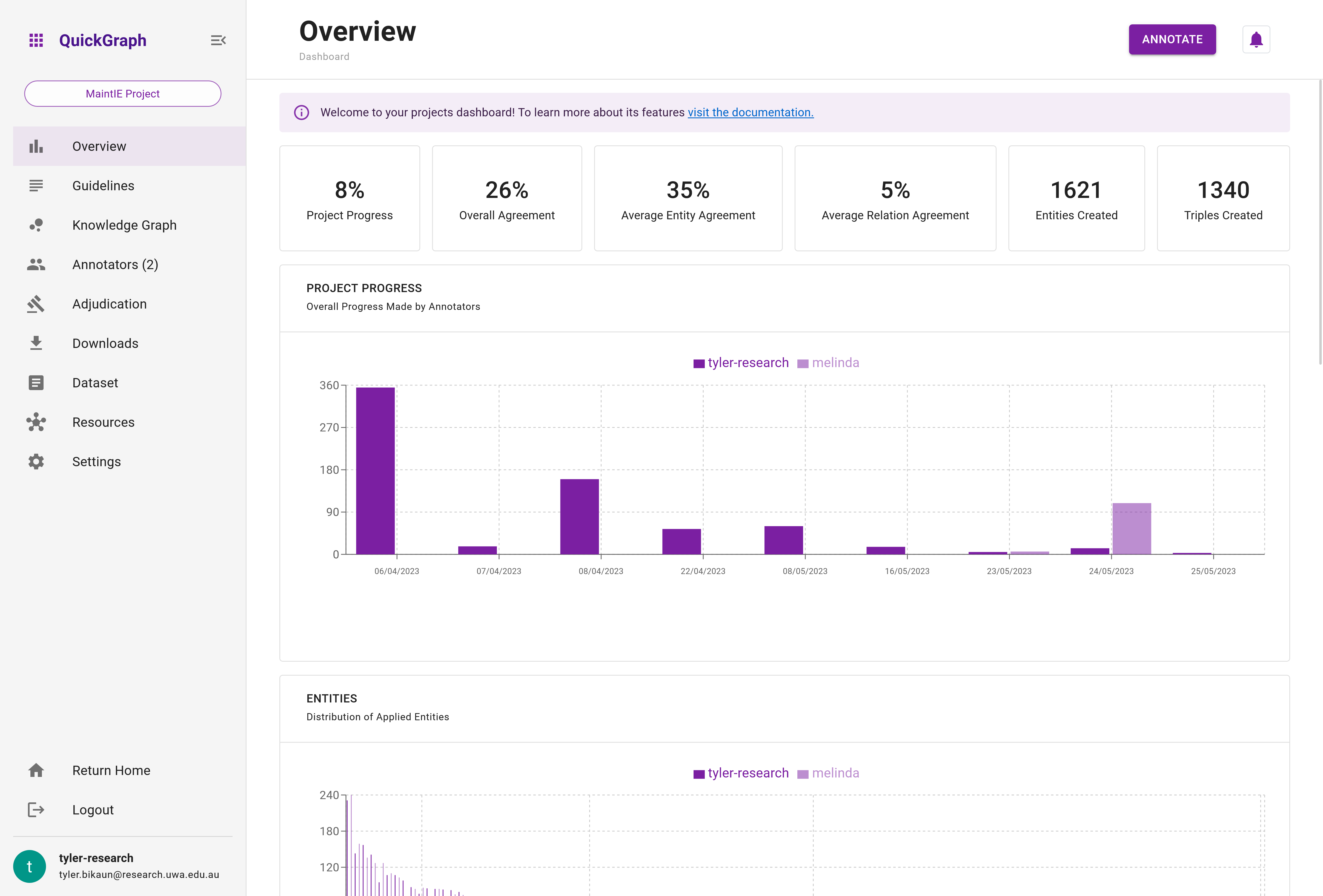
The overview page (Figure 1) of the project dashboard provides a comprehensive snapshot of your project's status and progress. It includes high-level metrics and visualisations that offer insights into various aspects of the annotation process, making it an essential tool for monitoring your project's performance.
High-Level Metrics
The high-level metrics displayed on the overview page give a quick understanding of your project's current state. These metrics include:
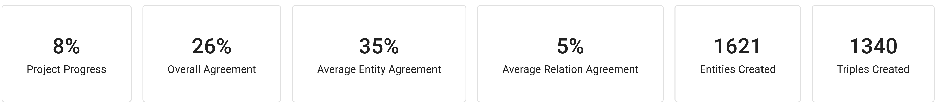
- Project Progress: A percentage that represents the overall completion of the project. This only considers dataset items that have met the minimum number of annotators.
- Overall Agreement: A measure of how consistently annotators are labeling the same data. For
entity annotation onlyprojects, this will be equivalent to theentity agreement. Whereas forentity and relation annotationprojects, this is currently the average entity and relation agreement. - Entity Agreement: A measure of the consistency among annotators for entity annotation tasks.
- Relation Agreement: A measure of the consistency among annotators for relation annotation tasks.
- Entities Created: The total number of entities annotated in the project that have majority agreement.
- Triples Created: The total number of triples (entity-relation-entity) annotated in the project that have majority agreement.
Note that if the project task is entity annotation only, the Entity Agreement, Relation Agreement, and Triples Created metrics will not be displayed.
Visualisations
The overview page also features a variety of plots that provide a deeper understanding of the project's progress and annotator performance. These plots include:
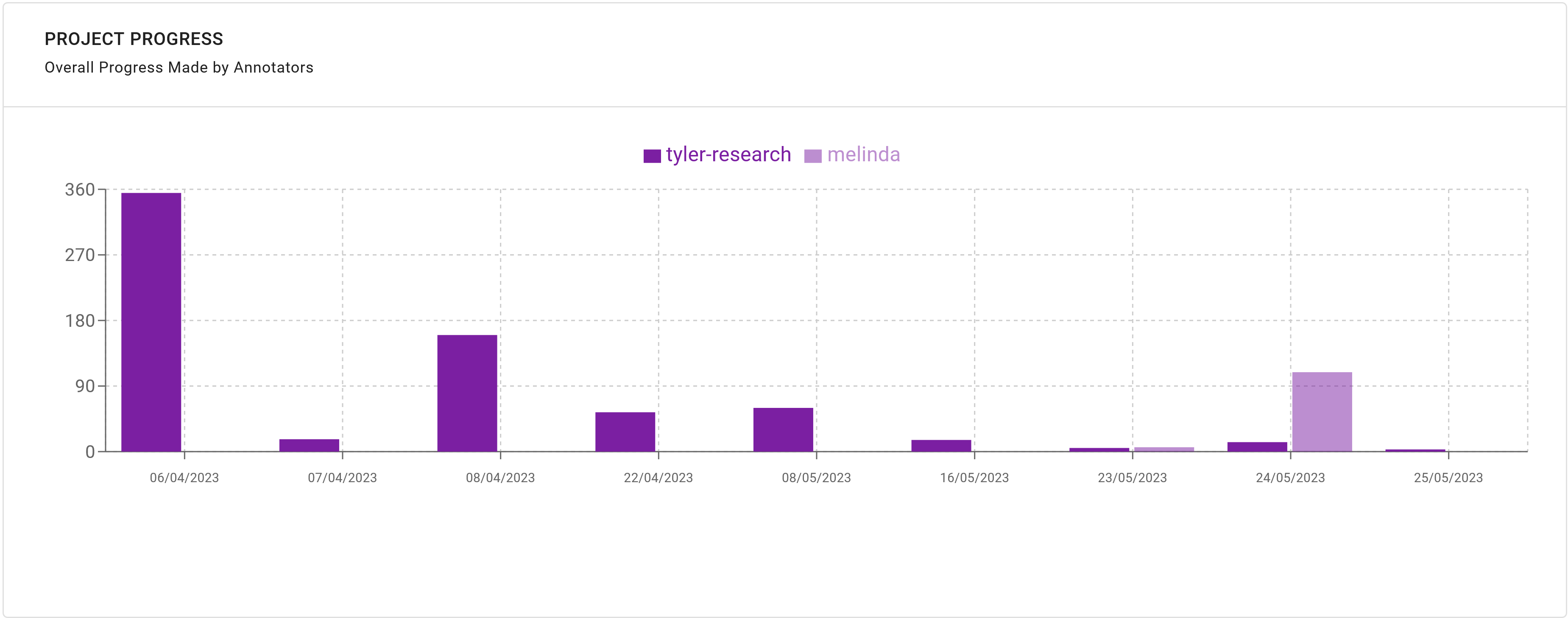
Project Progress Over Time
A bar chart that shows the daily progress (saved dataset items) made by all annotators. Only days where annotations are made are displayed.
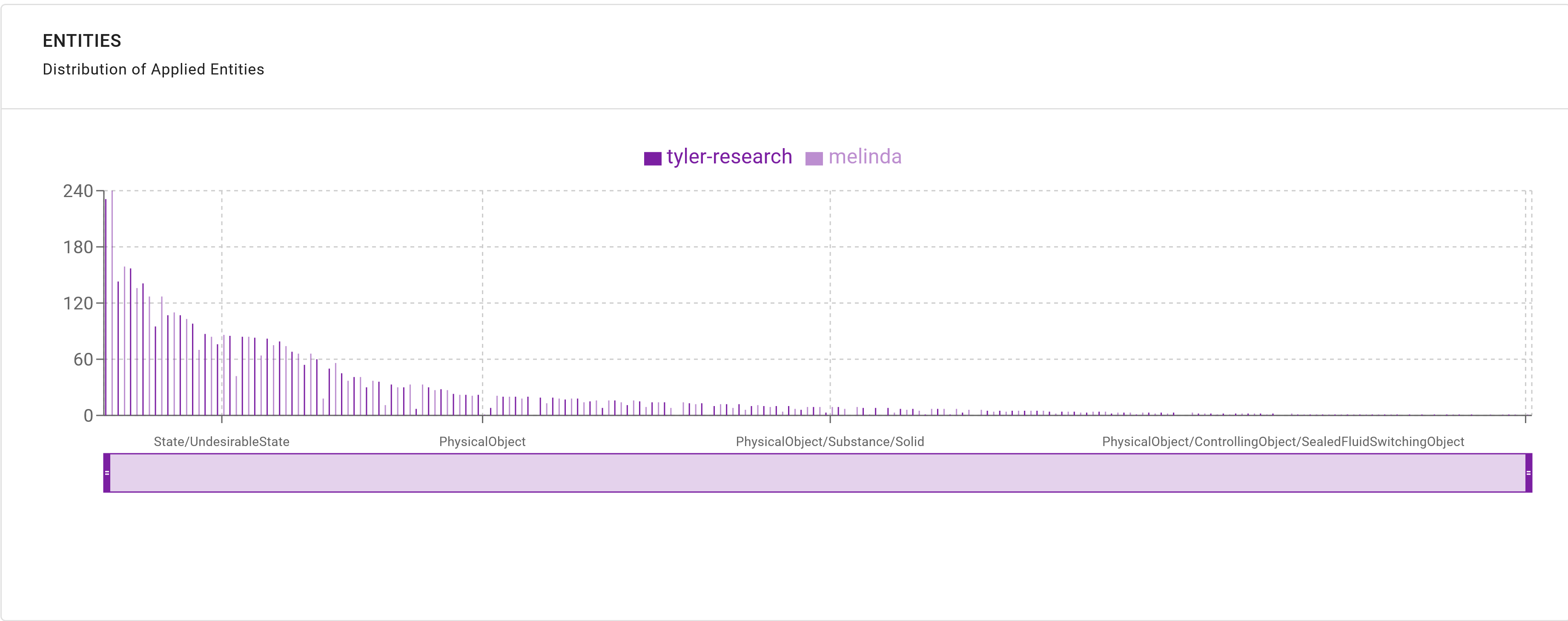
Distribution of Applied Entities (Silver and Weak Quality)
A bar chart displaying the distribution of applied entities for all annotators, separated into silver and weak quality annotations. The interactive x-axis brush allows navigation and zooming of entities.
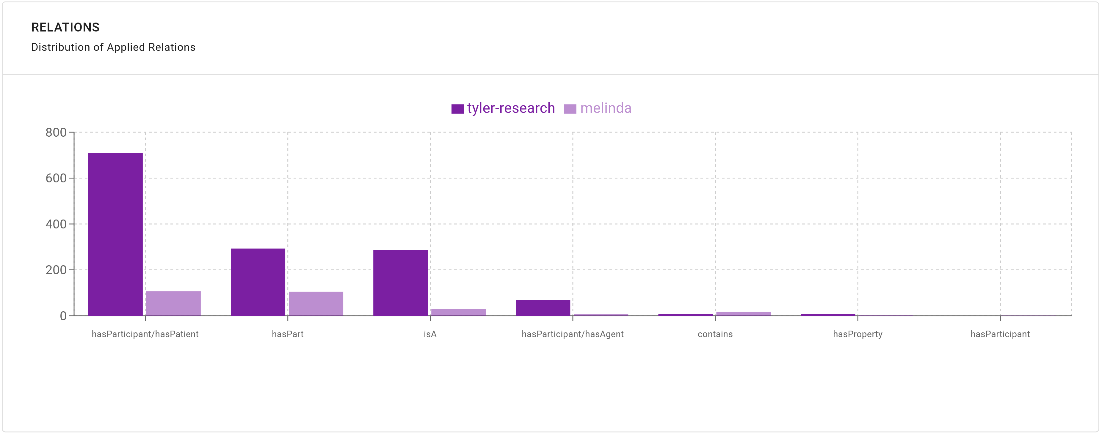
Distribution of Applied Relations (Silver and Weak Quality)
A bar chart showing the distribution of applied relations for all annotators, separated into silver and weak quality annotations. The interactive x-axis brush allows navigation and zooming of relations.
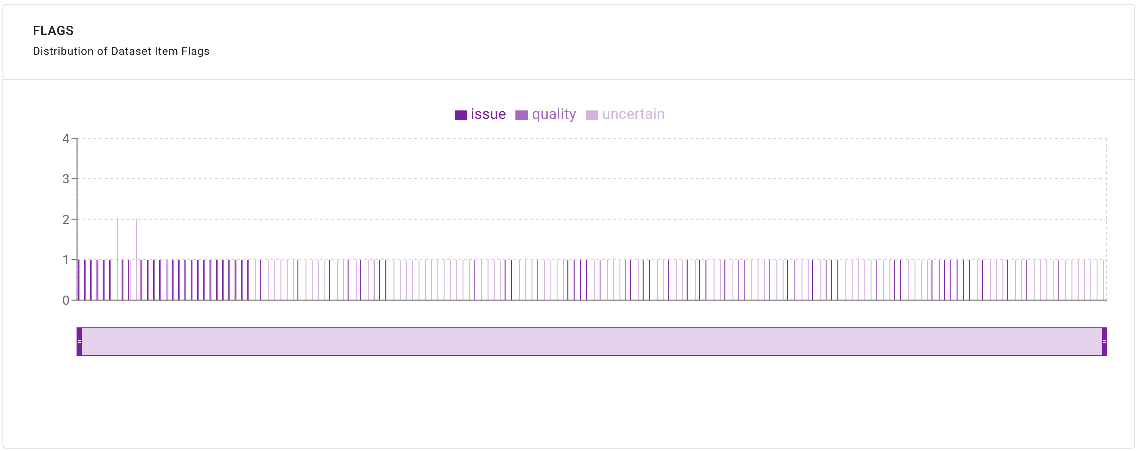
Distribution of Flags Applied by Each Annotator
A stacked bar chart illustrating the distribution of flags applied to each dataset item by project annotators. This allows for easy identification of potential issues or bottlenecks in the annotation process. The x-axis brush allows navigation and zooming on dataset items. Zooming in will reveal the dataset item id which can be used in the annotation search.
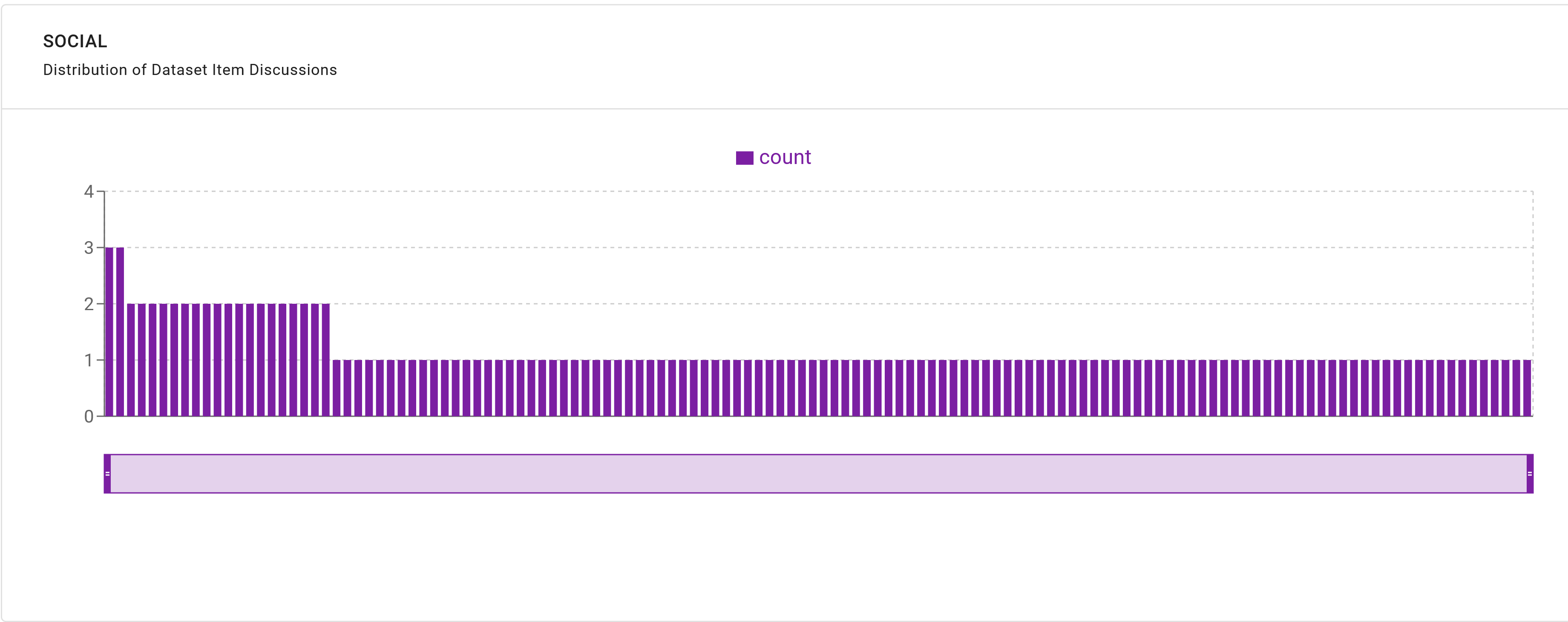
Distribution of Comments Made on Dataset Items
A bar chart that displays the distribution of comments made by annotators on dataset items, which can help identify areas where annotators require further clarification or guidance. The x-axis brush allows navigation and zooming on dataset items. Zooming in will reveal the dataset item id which can be used in the annotation search.
Note that if the project task is entity annotation only, the Distribution of Applied Relations (Silver and Weak Quality) will not be displayed.